Interactive components in plain React and CSS. Ten components, each one .tsx and one .css file. No animation library and no Tailwind required. Install with shadcn or copy the files.
Components 10 01 Code Window02 Dock03 Lens04 Product Stage05 Release Rail06 Focus Stack07 Command Palette08 Tabs09 Pricing10 Changelog01 / CODE WALKTHROUGHSelect a block of code and the part of the preview it renders is outlined. The steps can also play as a walkthrough.
Get source field-note.tsx finish.css
⧉ 01 <article className = "field-note" >
02 <header className = "note-header" >
03 <span >FIELD NOTES / 004 </span >
04 <span >↗ </span >
05 </header >
06
07 <div className = "note-artwork" >
08 <GlassStudy />
09 <span >STUDY IN STILLNESS </span >
10 </div >
11
12 <div className = "note-story" >
13 <p >Design / 4 min read </p >
14 <h2 >Somewhere in between. </h2 >
15 <span >Small observations. Better ideas. </span >
16 </div >
17 </article >
01 02 03 SELECT A BLOCK ↗ React + CSS
localhost
Design / 4 min read
Somewhere. Small observations. Better ideas. 01 Frame02 Artwork03 Details04 Finish
↻Replay 02 / 04 The card header: series label and link arrow. The artwork block and its caption. Category, headline, and summary. finish.css adds the background, border, radius, and shadow.
↗ Select a step to highlight its lines and its result.REAL CODE / LIVE PREVIEW
02 / NAVIGATIONIcon navigation that shows labels on hover or focus. A marker stays under the current section.
Get source INDEPENDENT BY DESIGN A differentordinary. Digital things with a human touch.
01 / FORM & FEEL THINKING OUT LOUD Notes fromthe margins. 01 The details do the talking CRAFT / 4 MIN 02 Leave a little room PROCESS / 3 MIN 03 Make it feel like something INTERACTION / 6 MIN A FICTIONAL DESIGNER Small studio.Wide curiosity. Meet Avery, the fictional designer and developer in this sample portfolio. The studio explores how digital things look, work, and feel.
BASED SOMEWHERE / WORKING EVERYWHERE a↗ ONE PAIR OF HANDS.
GOOD WORK STARTS WITH A CONVERSATION A new idea. An unfinished thing.
Let’s make it happen A fictional studio, a real navigation component. ↗ Hover or tab through the icons, then pick a section.LINKS OR BUTTONS / ARROW KEYS
03 / BEFORE & AFTERTwo aligned layers with a draggable divider. It's a native range input, so keyboard and touch work too.
Get source HOMEWARE / SPRING CATALOG Objects,. A small collection of things
Explore the collection SHOP THE CATALOG 01 — 06
HOMEWARE / SPRING CATALOG Objects,. A small collection of things
Explore the collection SHOP THE CATALOG 01 — 06
Original Refined Compare Original and Refined ↗ Drag the divider, or focus it and use the arrow keys.NATIVE RANGE INPUT
04 / PRODUCT TOURTabs that move a highlight frame across a screenshot or live interface, with a caption for each feature.
Get source Autoplay steps through all three features. 01 Summary The three numbers people check first. ↗ 02 Revenue chart Point at one part of a busy screen. ↗ 03 Activity feed Show what changed most recently. ↗ Pick a detail. See the difference.
YOUR WORKSPACE
Good things are taking shape. Last 30 days ⌄ Total revenue $24,680 +18.6% Active projects 12 +3 this month Momentum
↑ 18.6%
Jun 01 Jun 15 Jun 30
EL Website shipped Just now
MK Brand assets ready 24 minutes ago
JS New project created 1 hour ago
01 / 03 Revenue, active projects, and velocity for the last 30 days. The frame measures its target and resizes to fit it. Recent team events, newest first. ↗
↗ Pick a feature on the left to move the frame.MEASURED TARGETS
05 / DEPLOY STATUSA pipeline view for builds and deploys. Each stage shows its status, duration, and log, including failures.
Get source Plays a release where a check fails, then passes on retry. ↗ studio / website main
✓ Source 0.8s complete ✓ Build 12.4s complete ✓ Checks 3.2s complete ✓ Deploy 1.1s complete STAGE 01 / COMPLETE Source checked out. Fetched main and restored locked dependencies.
01 Checking out main at a1b2c3d↗ PRODUCTION v1.0.3
opalframe. Now with Read the changelog ↗
STAGE 02 / COMPLETE Build complete. Compiled routes and optimized assets.
03 Assets optimized: 148 kB↗ PRODUCTION v1.0.3
opalframe. Now with Read the changelog ↗
STAGE 03 / COMPLETE Checks passed. Types, tests, and accessibility checks passed.
03 Accessibility: no violations↗ PRODUCTION v1.0.3
opalframe. Now with Read the changelog ↗
STAGE 04 / COMPLETE Deployed. Version 1.0.3 is live in production.
03 Production alias assigned↗ PRODUCTION v1.0.3
opalframe. Now with Read the changelog ↗
4 of 4 stages complete.
↗ Replay a release. Try a failed check, then retry.SIMULATED DATA
06 / IMAGE GALLERYA fanned stack of images. Selecting one brings it to the front with its caption and link.
Get source Studio archive 01 / 03 ↙ Stack the deck
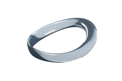
Soft Orbit ↗ Still Water ↗ Open Air ↗ Two interlocking silver and glass loops suspended above a pale blue surface. 01 Soft Orbit02 Still Water03 Open Air
Two interlocking loops in silver and glass. Select another image to bring it forward.
A glass sphere above fine water ripples.
Nested translucent cubes in porcelain and ice blue.
↗ Select an image, or stack and spread the deck.TABS / ARROW KEYS
07 / SEARCH & COMMANDSSearch a list of commands and run one with Enter. It opens over the page with ⌘K, or sits inline like this.
Get source Plays a search for “new in” and runs the top result. Acme Billing Invoices / October
↑ ↓ to move↵ to select
9 commands
↗ Type to filter, then press Enter or click a command.COMBOBOX / LISTBOX
08 / NAVIGATIONThe selected indicator slides between tabs, and a lighter highlight follows the pointer.
Get source acme-web Production is healthy. The last deploy finished 12 minutes ago.
99.98% uptime184 ms median response3 open alerts
Recent activity
Mira merged #482 12 min ago
Deploy to production 12 min ago
Jon opened #483 1 hour ago
Nightly backup 6 hours ago Deployments
v3.4.0 · production Live
v3.4.0 · preview Live
v3.3.2 · production Replaced
v3.3.1 · production Replaced Project settings
Region Frankfurt
Node.js 22.x
Build command npm run build
Preview branches All ↗ Hover across the tabs, then pick one or use the arrow keys.PILL OR UNDERLINE
09 / PRICINGPlan cards with a monthly and yearly switch. Prices count to the new amount when the period changes. The plans shown are for a fictional product.
Get source Fictional pricing Acme is a made-up product, and these plans and prices are examples. Opalframe itself is free.
Billing period Save 20%
Starter For side projects and trying Acme out.
$0 / month $0 per month
Free forever
Start for free
Team Most popular For small teams that ship every week.
$24 / month $24 per month
Billed monthly
Start a 14-day trial
Business For companies with review and compliance needs.
$59 / month $59 per month
Billed monthly
Contact sales Showing monthly prices.
The buttons call onSelect. Nothing is purchased.
↗ Switch between monthly and yearly billing.NATIVE RADIO BUTTONS
10 / CHANGELOGRelease notes on a timeline whose rail fills as you scroll. Filter by tag or open an entry for details.
Get source All7 Feature4 Improvement2 Fix2
Showing all 7 updates.
↗ Scroll the timeline, filter by tag, or open an entry.SCROLL-LINKED RAIL
MIT LICENSE INSTALLATION Install with shadcn,or copy two files. There is no package to keep updated. The component and its stylesheet live in your project, and you edit them like any other file.
Install Product Stage npx shadcn@latest add https://aduneer.github.io/opalframe/r/product-stage.jsonCopy command import { ProductStage } from
"@/components/ui/product-stage" ;
<ProductStage features={yourFeatures}>
<YourProductPreview />
</ProductStage> View the complete example MIT licensed. Change anything.
IN EVERY COMPONENT Keyboard support Native buttons, links, tabs, and range inputs underneath. Arrow keys, Home, and End work in lists. Checked with axe in CI.
Reduced motion Animated components follow the OS setting and take a reducedMotion prop. Timed walkthroughs play once and pause off-screen.
Plain CSS Scoped class names, with CSS variables for colors and sizes. Tailwind utilities work through className but aren't required.